
A Font Defines the New Office Ideology of Who is Worthy to Work

As a blogger and coach, I am always on the lookout for those small stories in the news that help capture larger trends in business and culture. It helps me explain larger trends with a concrete example that everyone can relate to. This week, the New York Times and other news outlets reported an example of something that occurred in government, reflecting how a powerful minority of leaders views the people who generate value for their organizations.
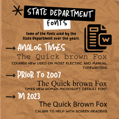
The State Department announced this week that it was reverting from Calibri to Times New Roman as the default typeface for all its documents. Normally, I would view this as a leader trying to create the impression of driving change without actually doing the necessary work. Instead, the Secretary of State explained that Calibri represents 'woke' culture, while Times New Roman is a professional and respectable font for the State Department. Once I read that, it was clear that this change was more than a superficial change by an impotent leader. It is the personification of how the State Department sees its diplomatic corps and duties.
Microsoft created Calibri as a font to enhance screen reading. It was inoffensive and generated neither strong pushback from designers nor desk jockeys. It was a fine, perfectly utilitarian sans-serif font that was the default setting in your Microsoft Word or Outlook. It was the fashion equivalent of a white t-shirt or black dress shoes; neutral and not calling attention to itself. I use the font for most of my business writing. I switch to Times New Roman when I am putting together my book manuscript because I see most books use it for their content. Different fonts for different purposes.
People who work with visual and cognitive disabilities appreciated Calibri because it worked well with screen readers and other tools, making work more accommodating for their needs. It was like installing elevators and wheelchair-access ramps. It is where the change in fonts transforms from annoyance to something more sinister, because the message it conveys is that people who are visually impaired or cognitively different are not valuable to the State Department. It is a form of control that tells workers that the boss values a particular type of worker over others.
I encountered this kind of behavior while working at a major bank in New York. I was sending daily status updates via email. The Vice President insisted I schedule the urgent 30-minute meeting with her and my supervisor. The room was thick with tension, and the Vice President told me my work was unacceptable. I was using Microsoft's default font for emails, and the Bank's branded correspondence was 10.5-point Helvetica. If this continued, my supervisor would remove me from the project.
I was dumbfounded. My emails were just internal reports about the project and testing status to other consultants at the bank. The Vice President considered my use of the Microsoft default font, Calibri 11-point, to be insubordination. My conduct did not harm the company; investors trusted its stability, leaving the corporate brand, stock price, and dividend untouched. The Vice President hammered me into place, a petty demonstration of power aimed at the consultant. Since I had no recourse, I could only suffer in silence. Six weeks later, I was off the project.
I could imagine what my experience would have been like if I had some form of visual disability. I had to fit into a particular box for presentations, conduct, and any deviation, no matter how small, was punishable by termination. Anything outside the box was considered deviant or insubordinate.
The entire perspective has a faint whiff of eugenics. Only those with the right traits can succeed in a corporate environment. Those with neurodivergence, cognitive disabilities, visual impairment, or different perspectives are not fit to be office workers, so any accommodation for them is a waste of money. We see this in other areas of the organization when workers are not allowed to use breast pumps when they return from maternity leave. People with ostomy bags cannot excuse themselves from meetings to address their hygiene concerns. Any form of accommodation is a waste of time and money. Clearly, the State Department and the Federal Government see anyone who does not look, act, or behave like someone in conservative media as unworthy.
It reminds me of a passage from Gilles Deleuze and Felix Guattari's book "A Thousand Plateaus," the emphasis is mine:
"Racism never detects the particles of the other; it propagates waves of sameness until those who resist identification have been wiped out (or those who only allow themselves to be identified at a given degree of divergence). It is cruelty is qualified only by its incompetence and naivete."
It is why the font change is more than a font change. It is a declaration that unless you match the ideal of a diplomat in the eyes of the President of the United States, you do not belong. People with disabilities and cognitive differences are a burden to the nation, and instead of accommodating them, they are pushed out of government and daily life.
It flies in the face of the Americans with Disabilities Act and common decency. With their administrations facing credible threats of war crimes in the "Double Tap" attacks in the open sea, this is small change. Unchecked by law or decency, the current administration acts with impunity.
Between 35 and 70 million American citizens have a disability, according to who you consult. The U.S. Census says that one in four families has someone dealing with a disability. If we treat these numbers with any seriousness, then ignoring disabled people and making them feel like non-productive members of society is wasteful. One of the most significant movements of the twentieth century was the shift from the quiet institutionalization of these individuals to their integration into society.
I would love to see a class action lawsuit or some other form of quiet resistance to this move by the State Department. Unfortunately, it will have to wait when a Democratic President returns to the White House and respect for disabled people returns. If you have disabled children or a parent you are supporting, you should make your concerns apparent to your local legislative officials.
The story of the font change will eventually be a footnote. Still, it is a symbol that the current political moment demands a perverse form of sameness and that people with disabilities are not welcome in the public square. I hope it is a temporary pause in the desire to continue integrating disabled people into work and public life.
Until next time.


Comments ()